Tiki
About
This app allows parents to set customized timers that control their children's usage of streaming and gaming apps, aligning these timers with predetermined screen time limits. Additionally, it offers metrics to assist parents in monitoring and ensuring that daily screen time stays within the established limits.
Project Details
Project Type: Academic, January - September 2023
My Role: UX Research, UX/UI Designer
Tools: Figma and Photoshop
Designed for: iOS
Timeline:
Research ~ 25 hrs
Strategy, Prototype & Test ~ 35 hrs
UI Design ~ 40 hrs
Responsive Marketing Website ~ 25 hrs
Why did I design this app?
20-30 minutes… It's all that a parent sometimes needs to complete a chore. I've been there; I've lived it. Therefore, I wanted a solution that allows one to control screen time for kids, addressing concerns about its impact while staying within usage limits.

Design Process of Tiki
I followed these steps to design the right solution for managing kids' screen time through a mobile app.
Problem Space
User Interview & Findings
Experience Map
User Persona
Opportunity Selection
User Stories & Epics
Task-flow selection
Moodboard
Colors & Typography
Brand Development
High-Fidelity Prototype
Prototype & Test
Sketching & Ideation
Wire-framing & Prototyping
Usability Test & Iterations
Responsive Marketing Website
Tiki in other platforms
Next Steps
Key Learnings
Research
Problem Space:

Children aged 5-17 exceed recommended screen time

Children aged 3-5 exceed recommended screen time (average 3 hrs per day)

Children aged 3-4 years meet screen time guidelines

Pediatrician guidelines:
For children under two years old Limit screen time is not recommended.
For children two to five years old limit screen time to less than one hour a day.
For children older than five limit screen time to less than two hours a day.
I used the following How Might We my criteria based on what I have personally experienced and read in my primary research:
How Might We support Canadian parents of children ages 2-8 to reduce screen time in order to avoid potential negative impacts on their emotional and cognitive development?
User Interview
Interview
I proceeded to conduct a qualitative research approach to understand the beliefs and attitudes of parents.
Therefore, I decided to conduct interviews with 3 participants who met the following criteria:
Canadian parents with children ages 2-8 who use screen time using any digital device such as a TV, phone, or tablet.
Canadian parents that have full-time jobs and stay at home.
I prepared a set of open-ended questions for the participants to identify key points that require focus in order to arrive at a solution for the problem statement.
Key Findings
Subsequently, I transcribed the responses from the interviewees and organized them into sticky notes. I then conducted an analysis, categorizing the thoughts into pain points, motivations, and behaviors. This allowed me to pinpoint the primary issue that needs to be addressed first for parents.
Pain Points
“I will put the TV on if I’m trying to make a recipe and I can’t concentrate.”
“I do notice that when he watches too much there’s a lot more temper tantrums”
“My toddler gets one hour of screen time each day when I need to make dinner.”
Motivations
“We have total control over what they watch, and he doesn’t ask for anything else”
“When my daughter wants to play, but I’m cooking, she asks for Peppa Pig”
“Sometimes there might be times when we’re home and I say that’s okay watch TV for half an hour”
Behaviours
“If there was a way to monitor and provide warnings about screen time usage, it would be really useful at home.”
“I would like to be able to follow the guidelines, one hour of television a day”
“Screen time it’s a way for me to get things done often.”
So after that, I proceeded to rephrase my How Might We question:
How Might We support Canadian parents of children aged 2-8 in tracking, managing, and scheduling screen time to reduce its amount of use?
Theme
Classifying the key findings of my interview in the Motivation, Behaviour, and Pain Points, helped me identify the theme to focus on for my app:

Theme - Tracking, Managing, and scheduling screen time
Reason - Parents need a screen time management solution that's super easy to use and gives them all the details on how much screen time their kid should be getting based on their age. They should be able to make a personalized schedule that works for their family and have tips on turning off screens when it's time to unplug. The app or software should also be user-friendly so that parents can easily set boundaries and help their children develop healthy screen habits.
User Persona
Meet Miranda, after analyzing the responses provided by the interviewers in my questionnaire and categorizing them based on pain points, behaviors, and motivations, I proceeded to draft a Persona, in this case, Miranda, representing the needs of parents today for this project.
Experience Mapping
I proceeded to understand the mindset of my persona to be able to identify the opportunities to help me identify the features that my app should include. The tool I used for my analysis was the experience mapping shown here.
2. Strategy
Opportunity Selection
I proceeded to list the opportunities to help me identify the features to consider for my app.
Provide suggestions of content that will give parents the amount of time required to do other tasks
Provide start counting automatically screen time for parents
Provide suggestions on how to transition from screen time to other activities without frustration
Opportunity to offer results of screen time tracking for awareness and comply with the pediatrics guidelines
Task Selection
Based on my theme and opportunity selection, I proceeded to choose the possible areas to start focusing on the design of my app.

Epic 1. Time Tracker

Epic 2. Finding and choosing content

Epic 3. Educational content
User Stories
As a parent, I want to control the TV screen schedule and time so that I can ensure that my child doesn't exceed the screen time recommended in the pediatric guidelines.
As a parent, I want to track screen time on every device that my child uses so that I can keep track of the time they spend watching or playing.
As a parent, I want, to set a screen time schedule for my child so that I can finish other tasks and not exceed the recommended time
As a parent, I want to be able to have an alert when getting close to the end of screen time for the day so that I can be aware of when to limit my child's screen time
As a parent, I want to control my child’s screen without having to physically access the electronic device they are using so that I have the flexibility to manage their screen time effectively.
As a parent, I want to have an option to manually track my child’s screen time so that I have the flexibility to manage their screen time effectively.
As I parent, I want to be able to see which apps or shows my child frequently watches or plays on the electronic device so that I can still monitor their usage.
As a parent, I want to have an option to automatically start tracking when my child starts using an app or watching TV so that I don’t forget to monitor their usage
As a parent, I want to have an option to pause my child's screen time so that I can do another activity with my child
As a parent, I want to have an easy transition when turning the screen off so that she doesn’t have tantrums.
Taskflow
I chose a time tracker since first it is required to solve the issue of making parents conscious about the time that their children are watching per day. As my next step, I proceeded to write down my user stories to define the user’s needs:
The user story I focused on was:
As a parent, I want to track the screen time of my child using a specific time so she doesn’t exceed the daily screen time allowance during the day.
The main task is:
Check place in the queue to obtain an estimated date for the surgery
Subtasks:
Countdown timer to track the screen time of the child
Show stats about screen time tracked
3. Prototype & Test
Sketches
I started drafting some sketches of the potential screens to include in my prototype for testing with users.
-
![]()
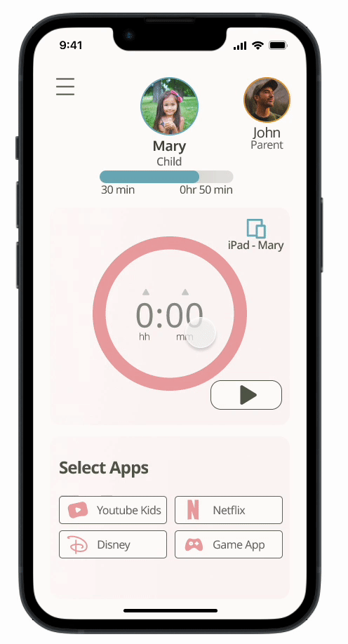
Home Page
This screen represents the initial sketch used as the foundation for designing the app. It encapsulates the essential features I envisioned to address the needs of parents.
-
![]()
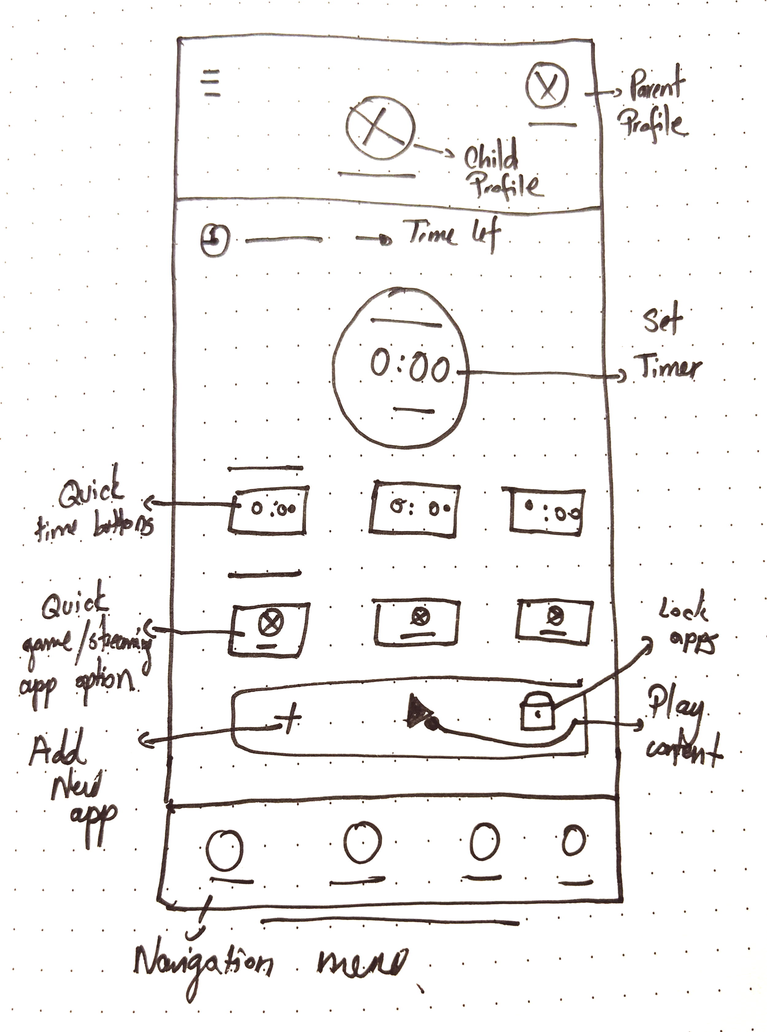
Prompt to indicate time is up
This prompt will signal the end of the allotted time to the parent's device. It will also provide an option for requesting a time extension
-
![Add more apps]()
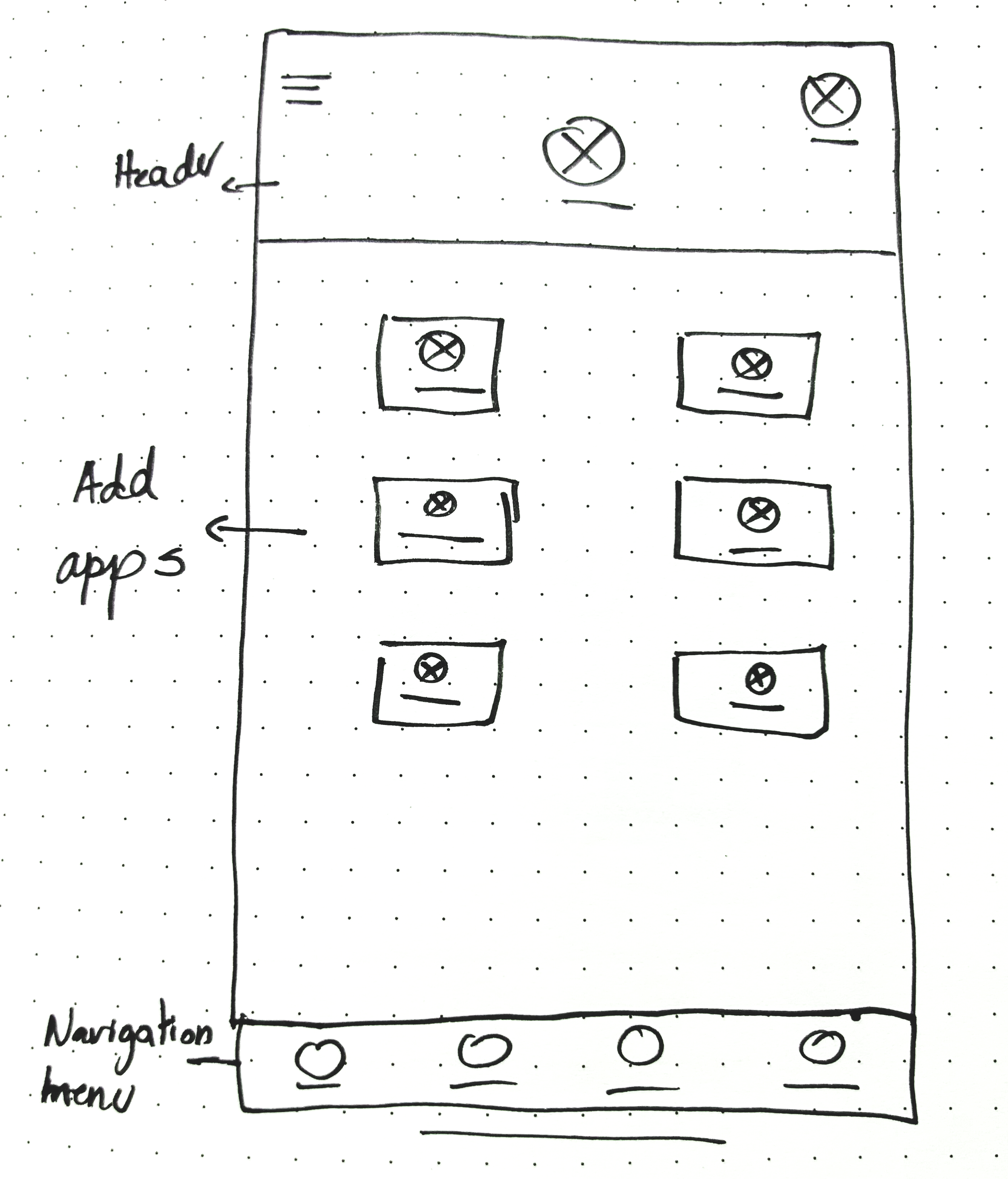
Add streaming/game app
This section enables parents to add streaming and gaming apps they have previously purchased.
-
![]()
Report
This section allows parents to view their child's screen time report, including daily and weekly usage statistics.


Mid-Fidelity Prototype & User Testing
As part of the screen time tracker design process, I planned to conduct two usability tests. In the first test, involving approximately 5 users, I evaluated the initial prototype. After analyzing the results, I proceeded to create the second prototype, which I then tested with another group of 5 users. This approach allowed me to gather practical, real-time feedback that could be integrated to enhance the design, ultimately leading to a more optimal user experience. The primary objective of these tests was to assess the alignment of the user flow with the app's main goal and to determine its ease of comprehension for users.
First Round - User Testing
Prototype 1 - Tasks
Task 1. Check the remaining daily screen time allowance.
Task 2 Add 30 min to the timer
Task 3. Select one streaming app for the child to watch
Task 4. Choose the app that is not shown on this screen
Task 5. Add extra 20 min
Task 6. Check the report of your child’s screentime
Video - Prototype 1
Results
All participants successfully completed Tasks 1, 2, and 4. Feedback was collected from Tasks 3 and 5, and users provided additional feedback throughout the test. I used this feedback to assess and redesign the screens. Below are the results:

Task 3. Select one streaming app for the child to watch
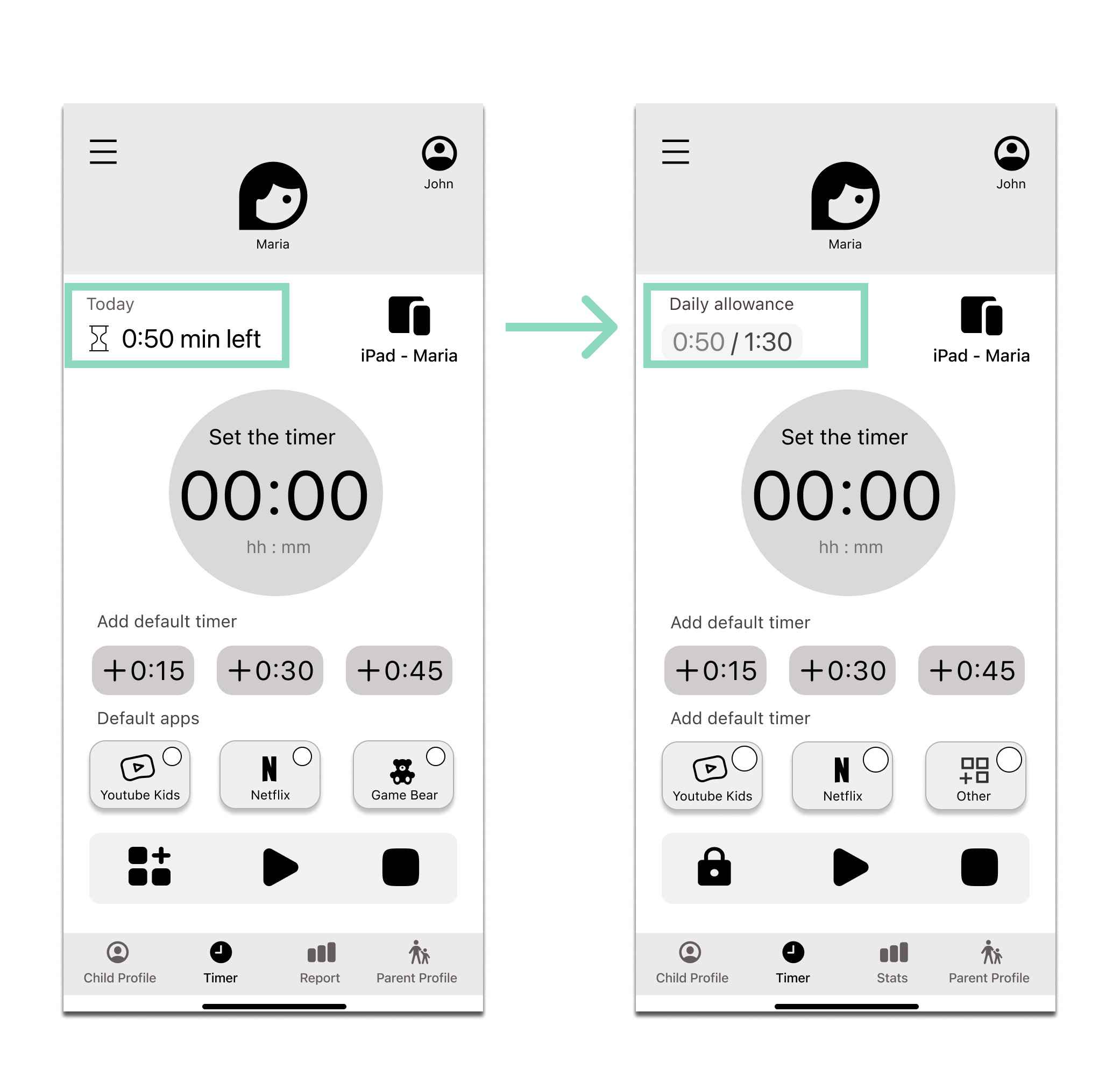
1 in 5 users found the time allowance per day information in the app prototype unclear. To improve clarity, I added the word 'Today' and a link to the child's profile, allowing users to check the screen time limit per day and understand its context.
Task 5. Add an extra 20 min to the timer
1 in 5 users didn't know how to add an extra 20 minutes to the timer. I also received feedback to include quick buttons for adding additional time to the timer.

Other changes based on feedback
I corrected an error of the placeholder “hh:ss” to “hh:mm”. (A) Reduced the time allocated for the quick buttons (B), and added a lock icon to indicate that other icons are restricted from use (C).
Second Round - User Testing
Video - Prototype 2
Prototype 2
Task 1. Check the remaining daily screen time allowance and the child's limit.
Task 2 Add 30 min to the timer
Task 3. Select one streaming app for the child to watch
Task 4. Choose a streaming app that is not shown on this screen
Task 5. Add extra 15 min
Task 6. Add another 15 min by making an exception
Task 7. Check the report of your child’s screentime
Task 1. Check the remaining daily screen time allowance and the child's limit.
2 in 5 users still couldn’t find the remaining screen time limit for the day. Therefore, I changed the wording from “Today” to “Daily allowance” and changed the format.

Task 4. Choose a streaming app that is not shown on this screen
Because 2 in 5 of users couldn't find the option to add other games or streaming apps on the main screen, I removed it from there, placed it on the profile screen, and changed the icon.
Task 7. Check the report of your child’s screentime
1 in 5 users couldn't find the option to add another 15 minutes after reaching the daily allowance in the app. Despite this confusion, I kept the option in the same location but changed the wording of the button below from 'Report' to 'Stats'.
Final Mid-Fidelity Design
Below, you can view the complete flow of my latest Mid-Fidelity prototype following rounds 1 and 2 of user testing.
4. UI Design
Moodboard
Before adding colors to my app design, I took some time to reflect on the message I wanted to convey to parents when they see and use the application. I began by describing my app using adjectives and comparisons:
More simplified than complicated
More balanced than overly strict
More mindful than hyperaware
More regulated than controlled
More playful than serious
Then, I created a moodboard to gather inspiration for the UI design of my app:
Colours & Typography
After finalizing my moodboard, I extracted the dominant colors from the images, ensuring they harmonized in tone. Then, I experimented with incorporating these colors into prototype screens, meticulously assessing whether they effectively conveyed the previously listed adjectives. Subsequently, I determined the specific colors for each feature within the app. Finally, I explored various fonts before settling on Noto Sans and Oxygen.
Wordmark
Inspiration

Brainstorming wordmarks
Exploring fonts, style and colors for my wordmark
My final version in colors, black and white
My icon design
High-Fidelity Prototype
After defining the UI design components, I injected colors into all my app screens and added animations to the prototype.
5. Forward Strategies
Marketing Website
I created a marketing website for Tiki’s app to establish a strong online presence and effectively convey its value to potential users. It serves user support and helps in user acquisition, retention, and engagement, making it an invaluable asset for the app's success.


Other Considerations

Launching an Tiki could benefit other people
Additional target audiences can derive value from Tiki. It can be particularly beneficial for adults looking to reduce their screen time or for use in educational settings, such as during exams. The app could also be adapted or redesigned in accordance with pediatrician guidelines.

Tiki has the potential to generate controversy
Since the app allows children to access streaming and gaming apps, some parents may not agree with its use and may believe that it encourages children to spend more time on screens, potentially disregarding recommended guidelines.
Tiki in other platforms
What is next?
Plan the installation flow for the child's Device
Collaborate with a potential developer to review designs and define the technical specs of the app
Develop Upcoming Epics: Content Discovery, Educational Instructions, and More
Design Integration with Apple Watch and TV for Tiki App
Key Learnings
A reason why technology is not fully embraced: Throughout the design process of Tiki, I got the reminder that what may seem obvious to users isn't always so, which often explains why certain incredible technologies haven't been fully embraced. Therefore, this is one of my purpose as a UX Designer.
Designing Tiki’s features: At every stage of this project, I found myself reflecting on the purpose of each feature and, most importantly, considering how it would benefit parents. During interviews, it was intriguing to witness the controversy and shame surrounding the admission that their children use screen time. It served as a reminder that parents are often time-constrained and in need of something quick and easy to use.
Make Tiki accessible: Considering accessibility during design is crucial as it makes your product inclusive, keeps you legally compliant, and shows social responsibility.
Reiterating designs: My design underwent multiple iterations, sometimes leading to changes in scope. This taught me that when the need arises to include a feature not initially considered in the mid-fidelity prototype, a valuable technique is to review the findings and task flow to confirm its absolute necessity.