Patient First
Patient First - UX Research
About
Project Details
The following research provides information on the experience of patients while waiting for their surgeries. Some of them are waiting for a longer period of time or don’t even have a surgery date. The study identified some dissatisfaction among patients that could potentially be resolved by focusing on the pain points, motivations, and behaviors of the people interviewed for this research.
Project Type: Academic March - June 2023
My Role: UX Research, UX/UI Designer
Tools: Figma and Photoshop
Designed for: iOS
Timeline:
Research ~ 15 hrs
Strategy, Prototype & Test ~ 25 hrs
UI Design ~ 25 hrs
UX Research Process - Patient First
I followed these steps to design the right solution for providing live updates to patients during their waiting period using a mobile app.
Problem Space
User Interview & Findings
Experience Map
User Persona
Opportunity Selection
User Stories & Epics
Task-flow selection
UI Inspiration Board
Sketches
Mid-Fidelity Prototype & User Testing
Next Steps
1. Research
Problem Space

The number of procedures in the waiting list is 1,228,047 across the 10 provinces in Canada
User Interview
Interview
Theme

The average waiting time is 27.4 weeks in 2022
These 3 participants had to meet the following criteria:
Aged 21 and up
Currently waiting for non-urgent surgery recommended by the surgical doctor
Located in Canada
Owns a digital device (computer, phone, tablet)
“My lifestyle has just gotten worse”
Motivations
“I would like to have more faith in my doctor”
For one procedure 3.2% of Canadians are waiting for treatment
I used the following How Might We my criteria based on what I have read in my primary research:
How Might We provide support to patients waiting for non-urgent surgeries in Canada to minimize the impact on their physical and emotional well-being?
I decided to implement a qualitative research approach, as the aim is to understand the beliefs and attitudes of patients while they wait for surgery. To achieve this, I interviewed 3 participants using open-ended questions to identify the key points that require focus to solve the problem statement.
The interview conducted touches personal aspects of the interviewer. Some of them became emotional when showing the concern that they didn’t have a date for their surgery, about the current state of their condition, and not knowing what will be their state after the surgery.
Key Findings
I transcribed the responses from the interviewees and organized them into sticky notes. This process helped me identify and classify key points based on goals, motivations, and behaviors. It enabled me to discern the genuine needs of patients on the waiting list for surgeries.
Pain Points
“I’m upset; it’s been over a year, and I’m still waiting.”
“I was happy that he was finally going to do the surgery”
User Persona
Behaviours
“I put a lot of things on hold because of that surgery”
“I asked quite frequently to know if the waiting list is moving”
Having sorted out the key points, helped me identify three potential themes to focus on for my app design such as:
Status Update: Patients would like to obtain information on the current status of the process or situation, as well as any updates or changes that have occurred since the last update.
Physical limitations: Patients feel by waiting for surgery, they have restrictions or inability to perform certain physical tasks
Preoperative and Postoperative Education: Patients would like to obtain more information and guidance to patients before or after they undergo a surgical procedure.
I picked the Status Update theme because I believe first it should address the issues of the waiting period for surgery. Getting the date for surgery is the priority of this target audience, therefore, they should be informed of the updates.
After that, I proceeded to rephrase my How Might We:
How Might We provide status updates to patients waiting for non-urgent surgeries in Canada in order to reduce their anxiety and enable them to plan and manage their schedules effectively for their emotional well-being?

2. Strategy
Opportunity Selection
Surgical Patient needs transparency in the process of obtaining a date for their surgery
Surgical Patient needs real-time updates on their wait time for the date of the surgery
Surgical Patient needs a one-on-one follow-up with the hospital/clinic while the wait time for the date of the surgery
Task Selection
Based on my theme and opportunity selection, I proceeded to choose the possible areas to start focusing on the design of my app.

EPIC 1: Waiting period for obtaining a surgery date
User Stories
EPIC 2: Updates during the wait time
EPIC 3: Interaction with the staff of the hospital/clinic
As I surgical patient I want to view the checklist of pre-requisites such as labs and visits so that I can determine when I can qualify to be added to the surgery queue.
As a surgical patient, I wouldn’t be able to see my position in the queue while waiting for my surgery date so that I can have transparency about the waiting period
As a surgical patient, I want to have available a graph of my waiting time at each stage leading up to my surgery so that I can understand more clearly the process of booking.
As a surgical patient, I want to be able to know if waiting time is affected by tests and visits to the hospital or clinic so that I can ensure there is anything delay in the scheduling of my surgery.
As a surgical patient, I want to know how my surgery is prioritized when assigning a date for my surgery so that I can have transparency in the booking process.
As a surgical patient, I want to have the ability to view and mark dates I'm not available for my surgery so that I can be assigned a date that I'm available or plan my schedule accordingly.
As a surgical patient, I want to know if I get into to standby list so that I can have an option to qualify for another date before my provided date.
As a surgical patient, being able to visually see the day of my surgery when is assigned I can be certain of the correct day for my surgery.
As a surgical patient, I want to receive a notification when there is an update of my waiting time to obtain a date for the surgery, I can have updates in real-time.
Taskflow


In the following slide is the task flow of the user story I chose:
As a surgical patient, I want to be able to see my position in the queue while waiting for my surgery date, so that I can have transparency about the waiting period
The main task is:
Check place in the queue to obtain an estimated date for the surgery
Subtasks:
Obtain average wait time including announcements that affect the queue
Show details in the queue including the history
3. UI Design
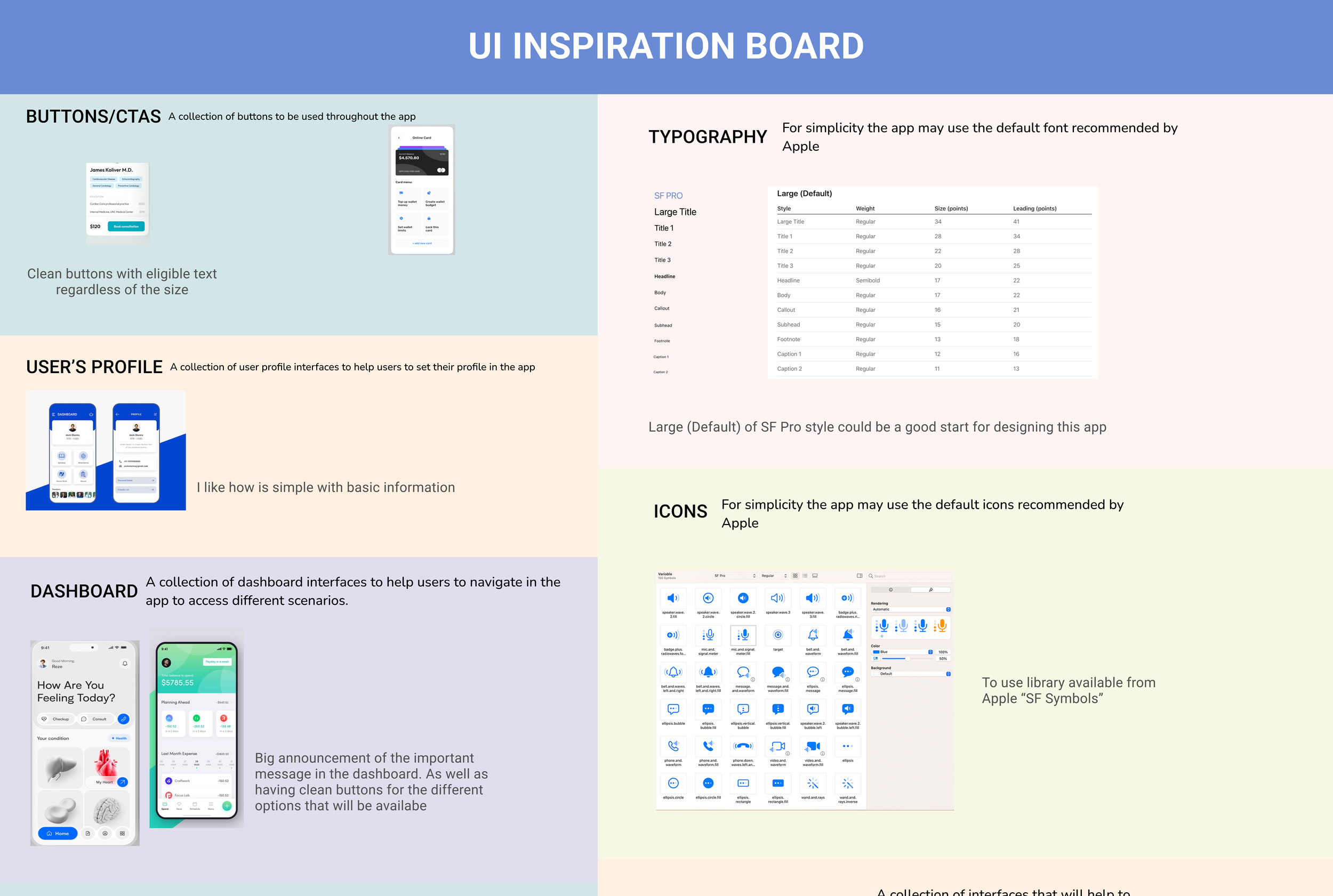
UI Inspiration board
I designed using Figma an UI inspiration board that will provide me with inspiration for creating screen designs that include the features mentioned in the task flow.
Sketches
I started drafting some sketches of the potential screens to include in my prototype for testing with users.
-
![]()
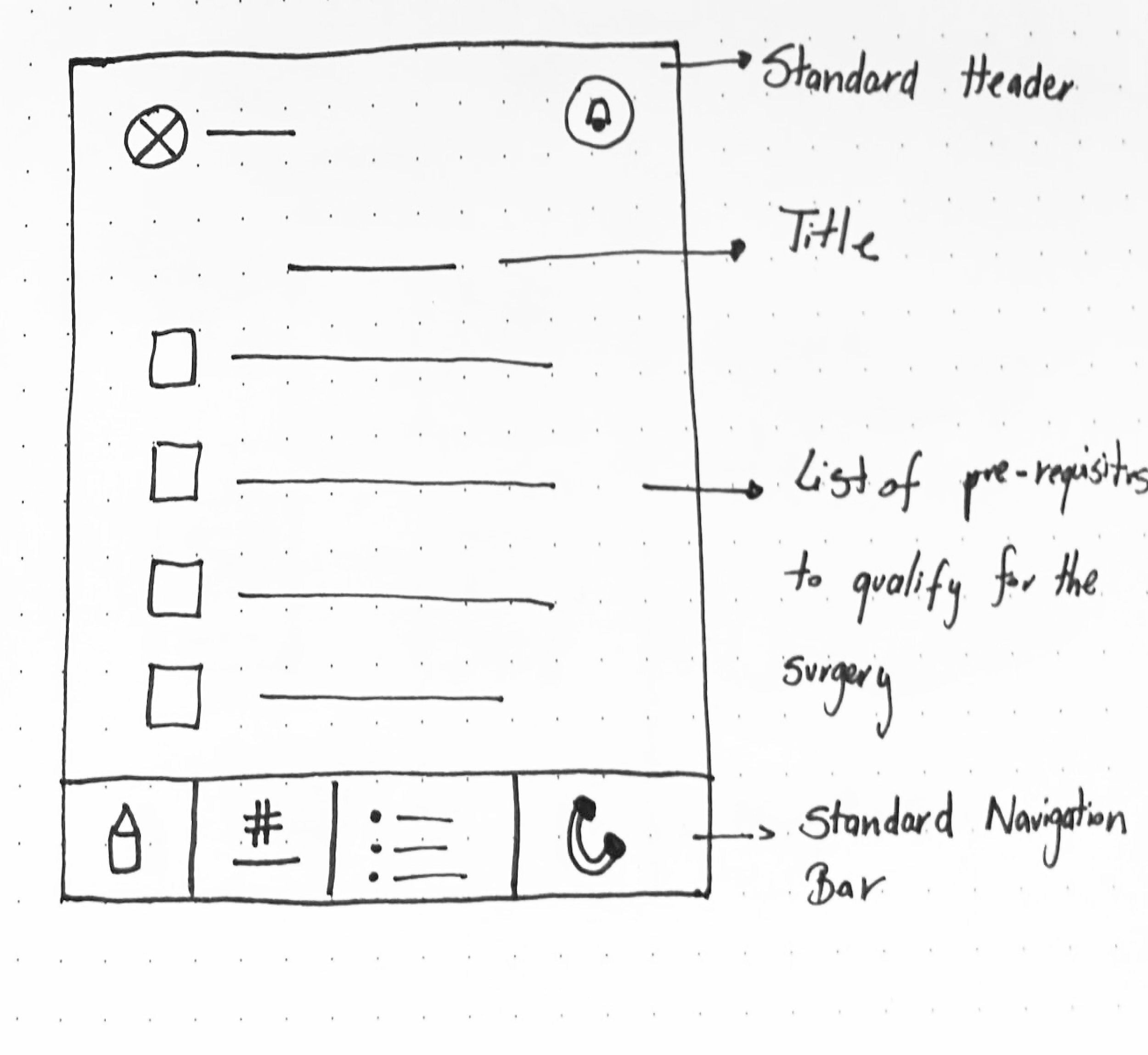
Missing Pre-requisites
This screen displays a list of prerequisites that must be met before qualifying for surgery.
-
![]()
List of Pre-requisites
This screen will display a list of prerequisites that are required to qualify for scheduling surgery with the doctor.
-
![]()
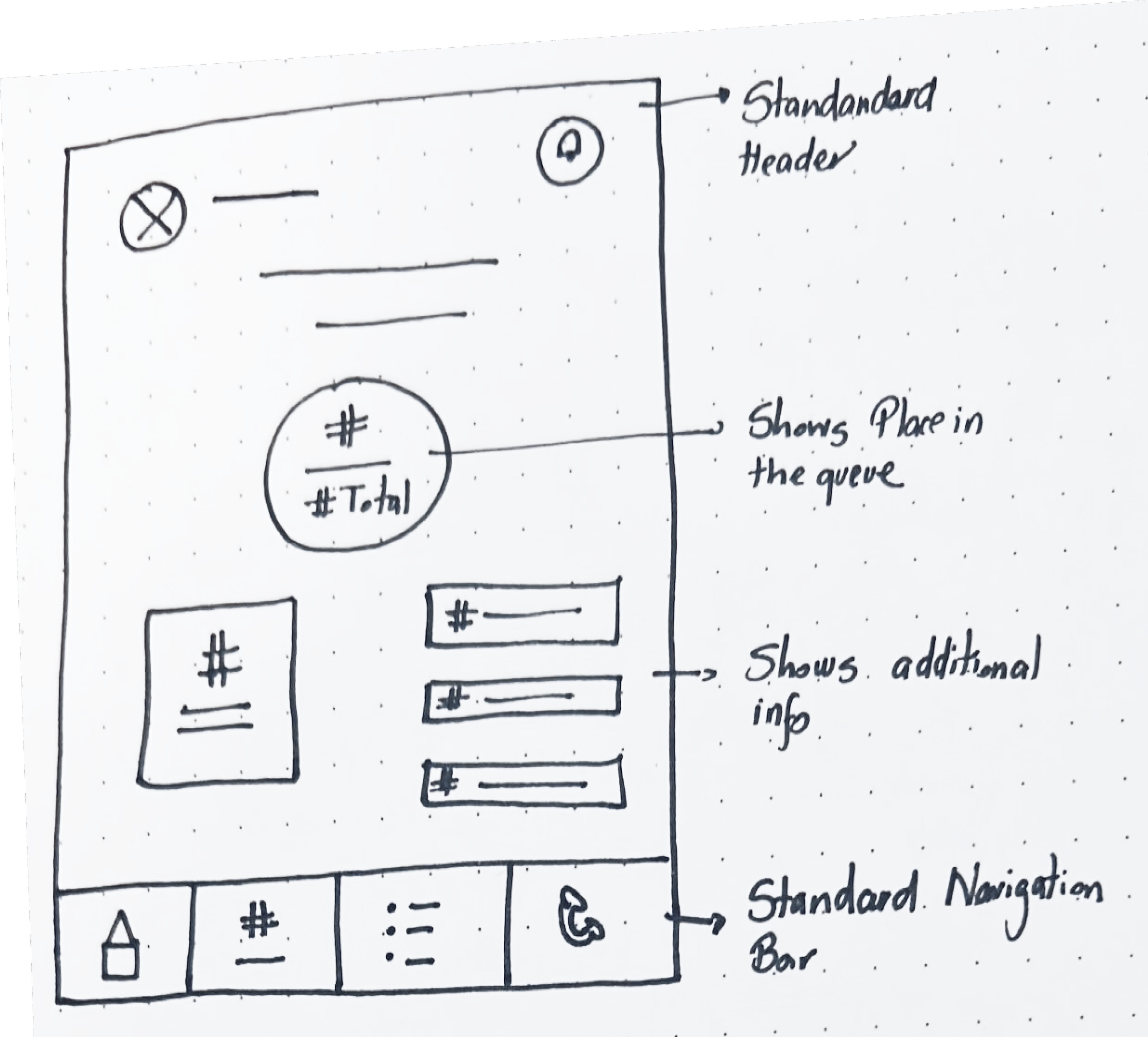
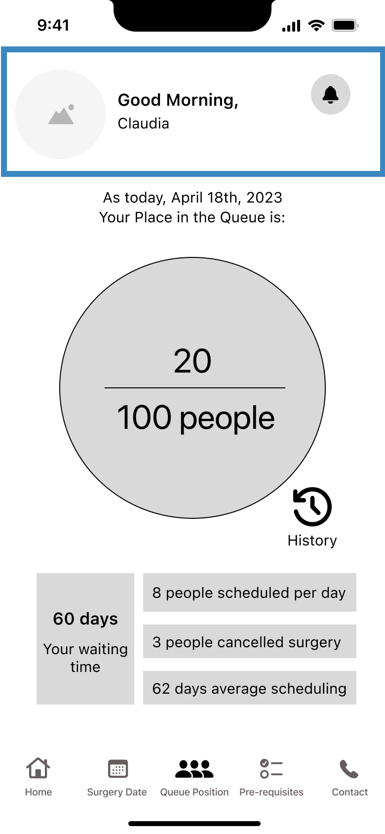
Place in the queue
This screen displays the surgery patient's place in the queue and is designed to provide additional details for transparency.
-
![]()
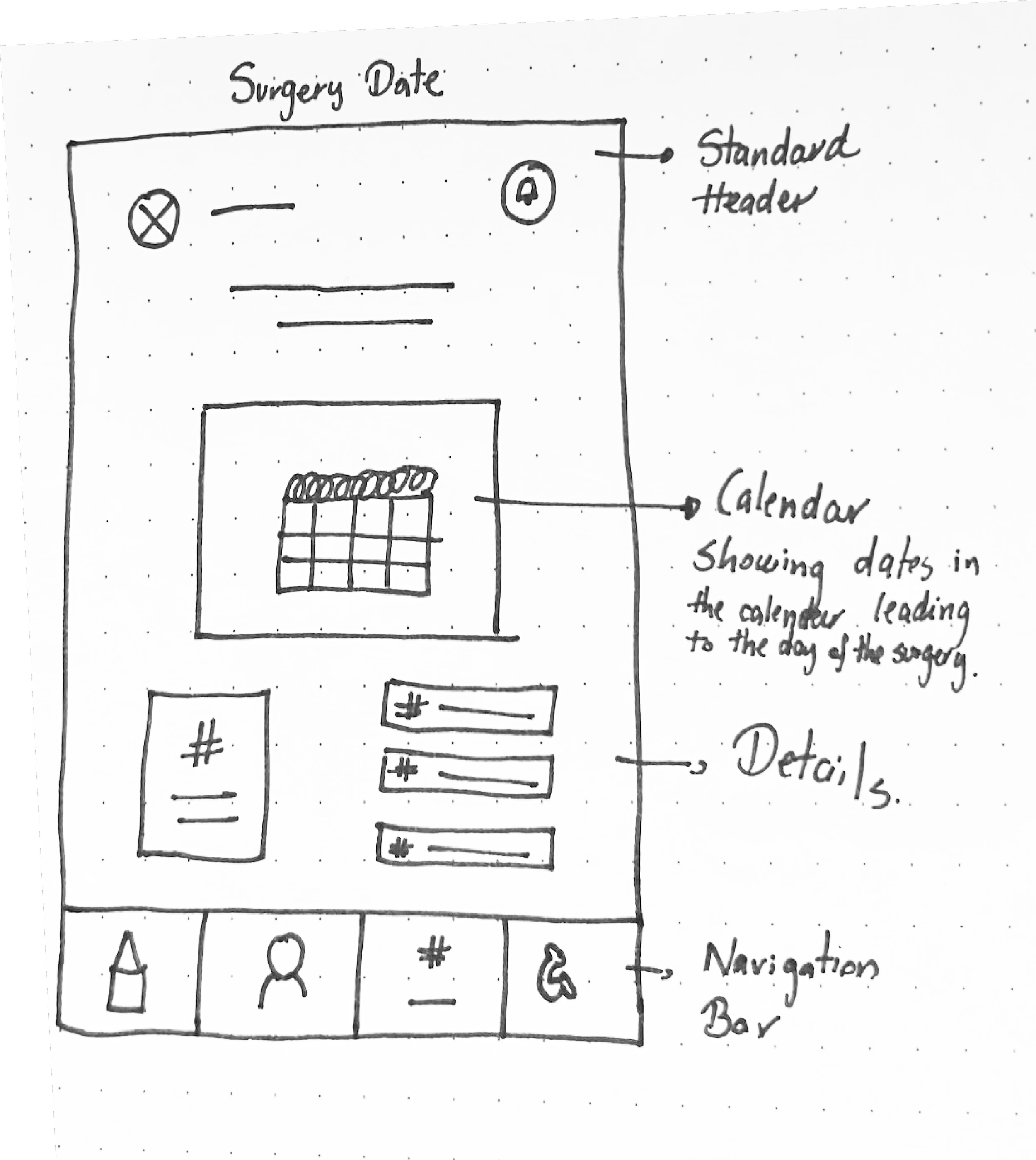
Surgery Date
This screen displays the scheduled surgery date, if available. Otherwise, it shows an estimated time for when the surgery will be available to the patient.
-
![]()
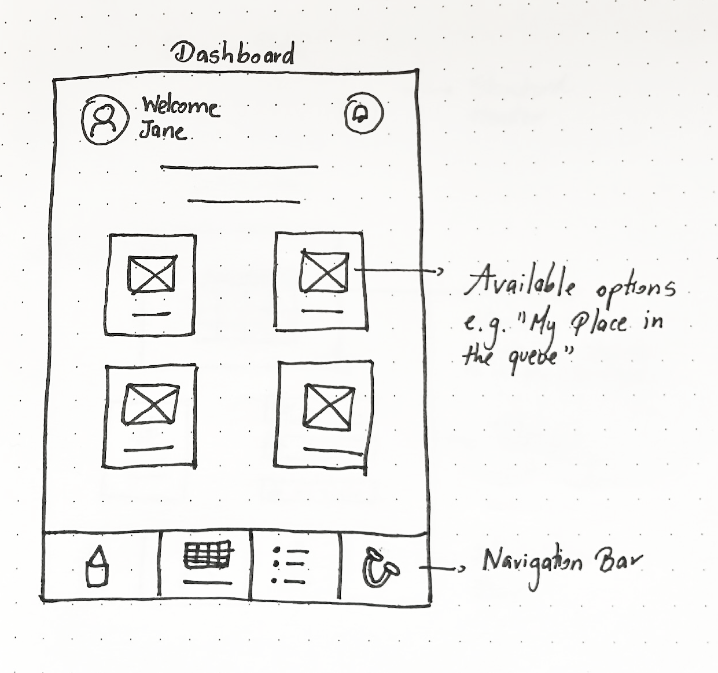
Dashboard
This screen provides options for accessing information about the waiting period that surgery patients must go through to schedule a surgery date.
-
![]()
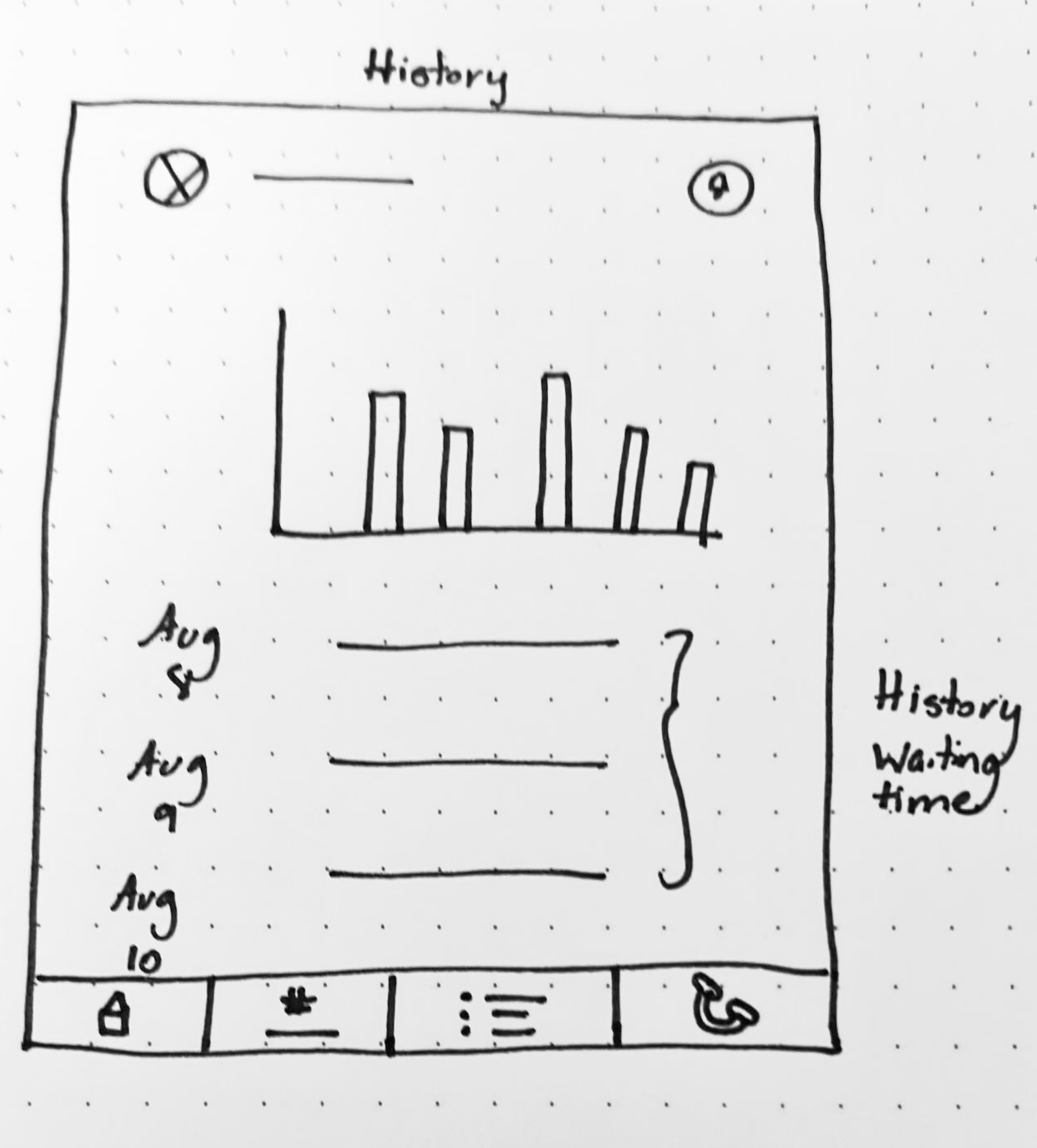
Report
This screen displays the patient's previous queue position or the countdown to their scheduled surgery date from prior days.

Mid-Fidelity Prototype & User Testing
At first, I designed the dashboard to be the first thing that surgery patients see. However, during prototype testing, I realized that if a patient did not meet certain prerequisites, they could not access other important details while waiting for a surgery date. This was because they were considered 'not qualified' yet. To address this scenario, I created an additional screen “Missing Pre-requisites”
First Round of user testing
As part of the app design to provide status updates to patients waiting for non-urgent surgeries, I conducted usability tests with about 5 users and 1 persona to obtain practical, real-time feedback that can be incorporated to improve the design, to provide a more optimal user experience.
The purpose of the test was to determine whether the flow aligns with the main goal of the app and if it is easy for users to understand.
It's worth mentioning that during the prototype testing, I couldn't cover all age demographics from 25 to 65 years old. However, my primary focus was on testing the flow and functionality of the app, which did not affect the app's overall goal. Here are the criteria that the interviewers needed to meet:
Familiar with the queue system
Checks regularly their mobile phone during the day
Familiar with mobile apps that provide status updates
The app will be the user’s reference to get the surgery date
Methodolody
I conducted user testing for my mid-fidelity prototype through a video call using Slack or Zoom.
I shared the Figma link with the participants and asked them to share their screens.
During the testing, I requested that the user think out loud, and I took notes of their feedback and suggestions. Additionally, I provided a list of steps for them to follow, including the main tasks to consider and validate in the mid-fidelity design.
If you would like to have a peek at the script that I used for this user study, you can access it through this page: Script.
Video - Prototype 1
Tell me what you understand about this screen. (Task 1) What to do next?
Tell me what this next screen tells you. Let’s assume that you call the doctor and find out that the last pre-requisite was completed. (Task 2) How would you call the doctor?
(Task 3) Go to My queue. What information you're getting here on the “My Queue” page?
(Task 4)How do check the history of how you were in the queue in the past?
(Task 5) Now, let’s go to the surgery date. What does this screen tell you?
Results
All participants demonstrated a clear understanding of the tasks and the app's main purpose, and provided valuable feedback on its features. They expressed appreciation for the app's transparency and the information in the screens.
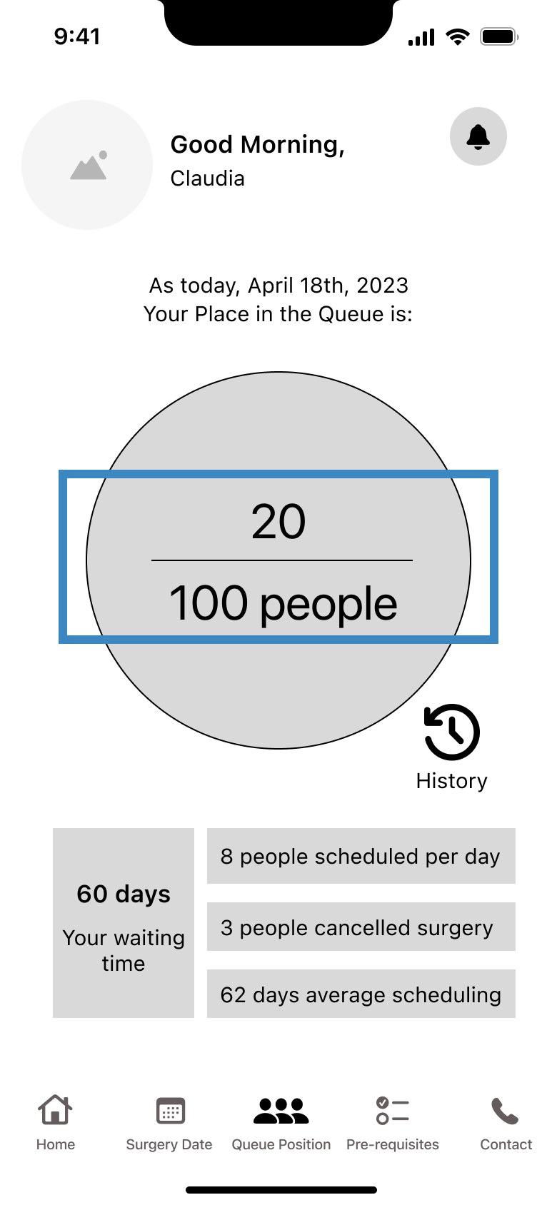
1. The math in “My Place in the Queue” needs to be revised. If 8 people are scheduled daily, the position in the queue or waiting time should change accordingly.

4. Be more specific about the historical information

2. Modify the method of displaying “Place in the Queue”, so the user doesn’t just work based on assumptions

5. Surgery date should show an approximate date of the surgery not counting the days to get the surgery
3. Not available a “Go back” option to go to the previous screen/main screen

6. When displaying the average waiting time, it is important to include the name of the hospital/clinic for clarity.
New Mid-Fidelity Prototype

‘Go back button’
A Go Back option was added on most of the screens. 2. Added more details of the information.

‘3 dots’ button
This button will contain more options to let the hospital/clinic know the available/unavailable days for scheduling the surgery.
Date
It shows the estimated date of when the surgery will be.
Next Steps

My place in the queue
It’s specified where is this history from “Surgery Date”.

Surgery date
It’s specified where is this history from “My Place in the queue”.
Add details when patient surgery have the option to mark a date as “unavailable” or be able to visualize “other potential dates”
Run another round of testing of the new prototype
Design High Fidelity Wireframe